4 Popular Room Design Color Schemes
For a faster, more profitable home sale

What is your favorite room design color scheme?
Do you favor lots of color in your design, or do you prefer the soothing calm of a monochromatic color palette, as in the picture on the right?
Color is deeply personal, most of us have a favorite color by the time we're three years old. Our favorite decor style usually develops later.
Do you know how to put the two together successfully?
Color is one of the keys to successful decorating— it can work magic by visually expanding or shrinking space, raising and lowering ceilings, even effecting our dispositions.
Below are examples of some of the most popular room design color schemes.
Continue reading to learn how to put these color palettes together successfully.
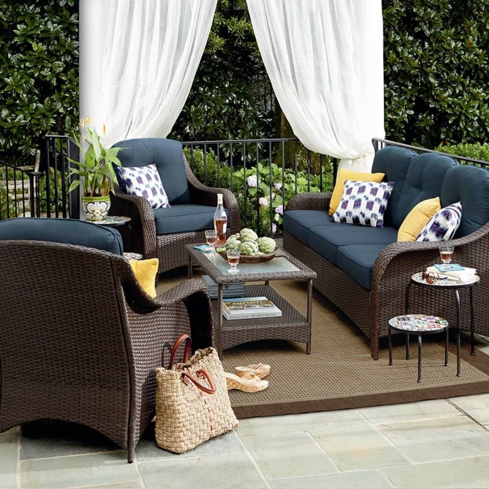
Analogous room design color schemes
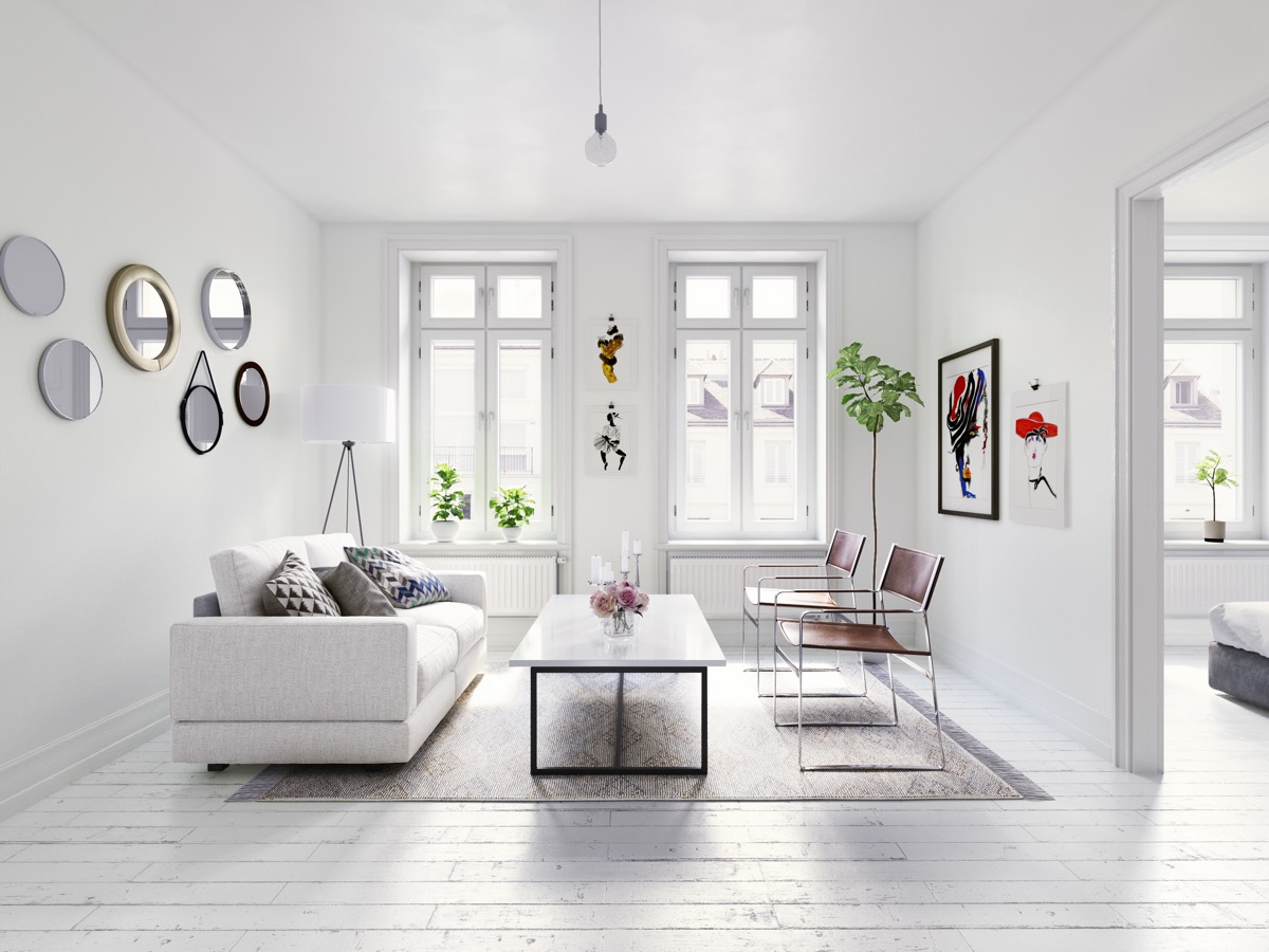
 This gorgeous living room is designed using an analogous color scheme. Note how one color dominates, while related colors are distributed throughout the room. Photo by Darling Doodles Design.
An analogous color scheme is probably the easiest to create, as the colors are conveniently located side-by-side on the color wheel. Colors are analogous when they are very similar to each other.
A properly done analogous color scheme will have a calm and harmonious feel.
Balancing the colors in an analogous color scheme
An analogous color palette will feature one main color; the others will be secondary in prominence. Secondary colors can be applied in smaller pops of color, like an upholstered chair, a throw blanket, pillows and accessories.

As analogous colors are so similar, be sure to use texture and pattern in your room design to differentiate between the colors and keep them from blending too much.
The primary, secondary and tertiary colors in this design scheme are harmonious and occur naturally in nature.
Examples of this are the changing colors you see in fall foliage; red, red-orange and orange.
Another example can be found in camouflage color combinations, where no specific color stands out from the others.
Analogous color schemes are used often in interior decorating to convey intense emotion and mood.
This is something to consider when you select colors for a guest room. Remember the saying about guests and the color yellow...
Analogous color combinations can encompass three to five hues with just one primary color. This color scheme works well in informal rooms such as, bedrooms, family rooms and dens.
When designing a room using an analogous color scheme, use the 60-30-10 rule:
- 60% of the room should consist of a dominate color; walls and ceilings, for example
- 30% should be a secondary color; upholstered furniture, for example.
- 10% of your color scheme should be an accent color to provide visual interest to the room, usually in the form of accessories, like pillows and throws.
Complementary room design color schemes

Complementary color schemes use hues that are direct opposites on the color wheel.
These color combinations work best when one color dominates over the other, as in the bedroom picture above. Complementary colors complete and enrich the other.

Examples of complementary color combinations are red-green, blue-orange, and yellow-purple. If you get the color saturation right, the colors will scintillate with each other.
If you get it wrong, it can result in tension caused by the colors vibrating uncomfortably off each other. The effect can be jarring, so a deft eye is required when designing a room using this color scheme.
Apply complementary colors in unequal amounts by using the 80-20 rule:
- The predominate shade should be 80%, the second color, 20%.

- If used in equal proportions, complementary colors will compete with each other, creating a jarring effect that may make some people feel anxious.
The complementary color scheme in this bathroom works well, because the background is very light and dominate, using the 80/20 ratio successfully.
The orange towels contrast nicely and are in good proportion against the tile. If the colors were reversed, it might be a different story, as orange tile would be difficult to live with for most.
Complementary color schemes work successfully in formal rooms like dining and living rooms, or in contemporary style rooms, such as the children's bedroom pictured above.
See how the orange towels in this bathroom pop against the blue tile.
Monochromatic room design color schemes

This low-contrast color scheme is my favorite room decor color scheme and the most successful color palette for small room design.
Monochromatic room design employs a single color in varied tones, shades and tints. The single color can vary greatly in value and saturation, creating a sophisticated and restful space as in the bedroom above.
Done incorrectly, a monochromatic color scheme can be bland and boring. Monochromatic color schemes rely heavily on natural and textural elements to create interest.
Designer, Alyssa Kapito, states, "when you remove all color from a space, texture, tone, and lines become so much more important."
Monochromatic room design color schemes can create harmony, visual cohesion, and a sense of relaxation in any room, making it the perfect color scheme for home staging.
Any color can be used in monochromatic room design, but typically, colors used for the purpose of home staging are neutrals like whites, beiges and grays.
Imagine a monochromatic room with red or yellow, from floor to ceiling as the color palette! It can be done successfully with careful application.
Many people may yawn at the idea of a room that is basically designed around one color, but by incorporating variations in tones and textures, accessorizing with glass, objects from nature, greenery, basketry, you can create a feeling of spaciousness and sophistication.
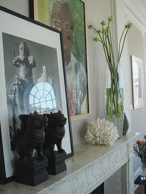
A monochromatic color scheme in earth tones make a perfect backdrop for displaying artwork.
Where to start with this look?
If you are timid, start with the lightest color possible of the hue you like and build from there. You can always add darker tones gradually. If something pops out at you, creating a jarring feel, you may want to remove it. After all, this style is all about harmony and relaxation.
Be sure to bring in texture through fabrics, plants, basketry, wood, glass, and metal from lamp fixtures, etc.
Monotone room design color schemes
 This monotone living room is lovely, with structural white accents and interesting textural elements. Photo by madebymood.com
This sophisticated color scheme focuses on one color with very little variation in value, saturation, and brightness.
This is not the easiest design to achieve, but if done properly, can result in a stylish, fresh room with a calm and open feeling. On the other spectrum, if done poorly, the result will live up to its name, monotone... boring!
Like monochromatic room design, this design relies heavily on warm textural elements, pattern, and contrast to make it successful.
The monotone color scheme can be calm and soothing and has the effect of enlarging space, making it an ideal room design color scheme for small spaces and home staging.
How to get this look:
The monotone look can be rescued from total blandness by accessorizing with subtle patterns, greenery, glass, metals, wood furniture elements and textural features in fabrics. Mix different textures of fabrics, like smooth, shiny satins, knitted throws, velvets, or something more rustic.
Introduce wood accents to your room. Wood will add warmth to a monochromatic room. Be sure that the wood colors don't stray too far from the color of your palette.
Add texture in the form of greenery. Plants add life and interest to any room. Add texture through fabrics, patterned tiles, area rugs, lamp shades, and wall art.
Don't forget to accent with metal, in the form of light fixtures, artwork, furniture arms and legs.
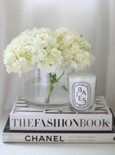
Like the monochromatic style, the monotone look also creates a great backdrop for artwork and collections.
White is typically used in combination with monotone and monochromatic color schemes, in the form of window trim, molding, doors and door casings.
Return from 4 Popular Room Design Color Schemes to Home Page
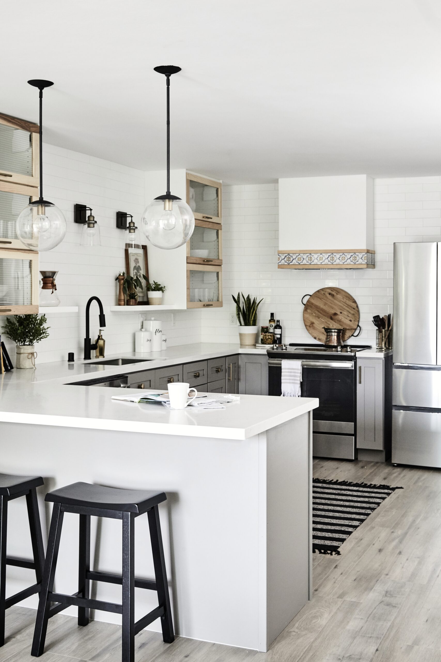
You may also like
How to create an outdoor living space that buyers will love
How to make a vignette like a pro
Leaning pictures and mirrors (the easy alternative to hanging art)
15 Great small kitchen decorating ideas that buyers will love
15 Small living room ideas that will make it look bigger
Six must-have online real estate photos
7 beautiful ideas for painting interior brick fireplaces

Holiday home staging - a good time to sell your house